This image begins life as something almost brutally factual: a massive MSC container ship at night, cranes stretched like skeletal ribs against a dark sky, containers stacked into rigid grids, work lights glittering across black water. In its oil-painting transformation, though, the scene loosens its grip on pure documentation. Brushstrokes soften the geometry, lights bleed into golds and ambers, reflections tremble instead of mirror, and the whole port feels less like infrastructure and more like a living organism that never really sleeps. You still recognize the ship, the scale, the industry, but the image no longer asks you to count containers or identify a terminal. It asks you to feel the weight of global movement, the hum of trade, the quiet tension between human engineering and night.
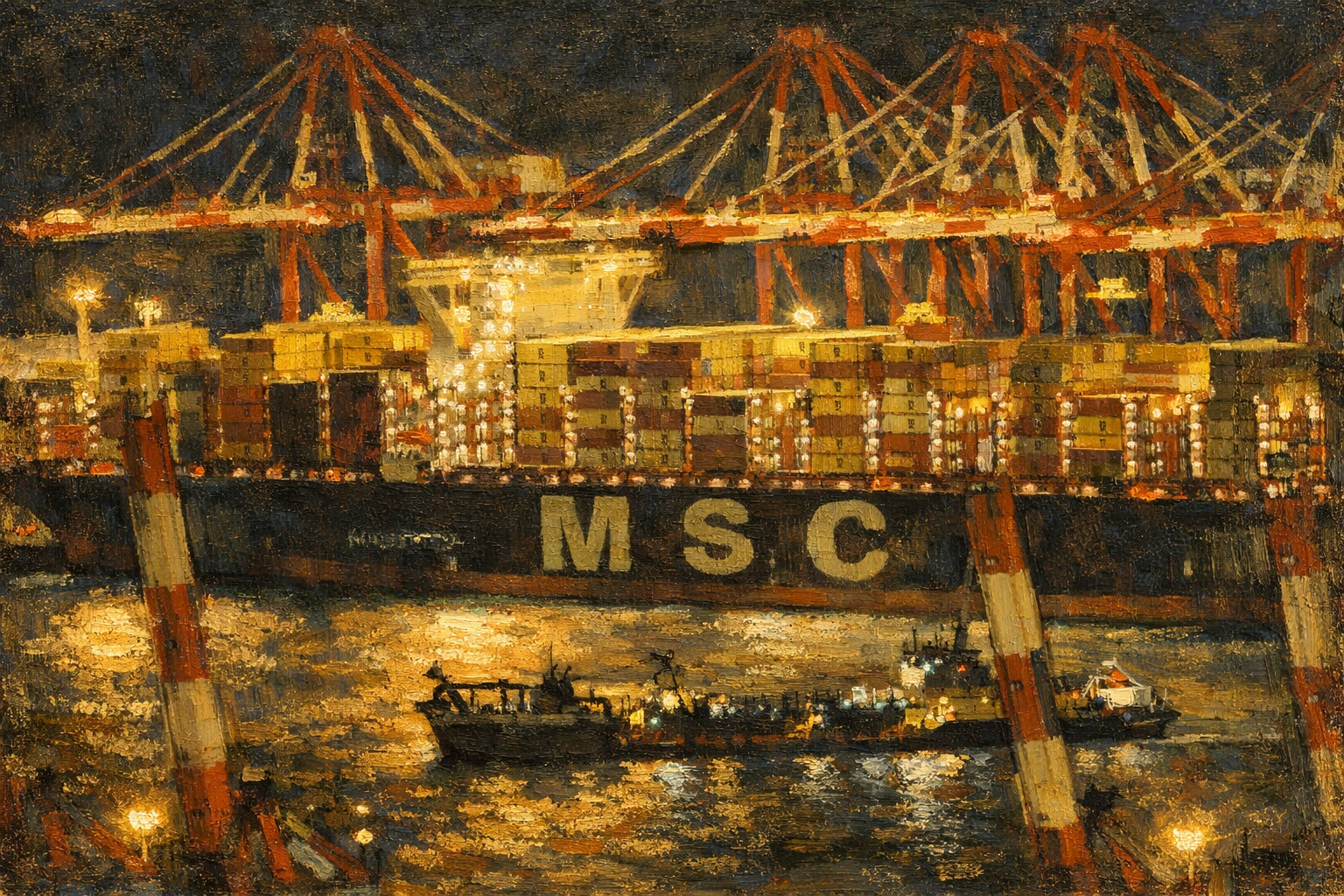
This is exactly where painterly images become powerful tools in media. In news, analysis, or long-form storytelling, literal photography can sometimes be too precise, almost too complete. It tells you what happened, where, and when, but it often shuts down interpretation. An image like this, rendered in an impressionistic oil style, opens space instead of closing it. It works especially well in stories about systems rather than events: global supply chains, maritime logistics, energy flows, trade disruptions, or economic pressure points. The softened edges and expressive texture signal that the story is not about one ship on one night, but about something larger, slower, and harder to pin down. Readers linger longer, not because the image explains more, but because it explains less in a more suggestive way.
In editorial and analytical media, these images act almost like visual metaphors. The glowing cranes become symbols of constant labor, the shimmering water hints at fragility beneath apparent strength, and the blurred motion of smaller vessels suggests the human scale moving under colossal structures. When paired with text about market volatility, geopolitical tension, or industrial transformation, such imagery reinforces tone without competing for factual authority. It does not argue with the data; it frames the mood in which the data should be read. That’s a subtle but crucial distinction, especially for platforms that want to feel thoughtful rather than sensational.
There’s also a practical advantage. Painterly images age better. A straight photograph of a specific ship, terminal, or moment can feel outdated quickly once circumstances change. An impressionistic rendering resists that decay. It becomes illustrative rather than archival, reusable across articles, newsletters, and background explainers without feeling recycled. For digital publications, this matters. Visual continuity builds identity, and a consistent use of stylized imagery can quietly signal editorial voice: reflective, analytical, human-scaled, not just reactive.
Used carefully, images like this don’t replace photography; they complement it. Raw photos anchor reality. Painterly interpretations translate that reality into atmosphere and meaning. In a media landscape saturated with sharp, instant visuals, choosing an image that slows the eye and invites interpretation can be a strategic decision, not an aesthetic indulgence. Sometimes the most effective way to show how the world works is not to show it exactly as it looks, but as it feels when you step back and really think about it.
Leave a Reply