The test is not whether a picture looks good in black and white. Almost everything looks acceptable in black and white. The test is whether the colour version is using its colour for anything, and in this frame it is not.
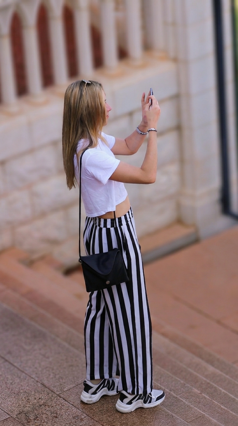
Here is the colour original. Warm sandstone wall, terracotta paving on the upper landing, grey stone steps below, hair and skin in the middle. That is the entire palette. Four warm neutrals and one cool grey, none of them attached to anything the picture is about.
What the colour is doing wrong
The subject is already a black and white graphic. Striped trousers, white tee, black bag, black and white sneakers. There is no colour in the outfit at all, which means every bit of chroma in the picture sits in the background.
That creates a split. The terracotta landing is noticeably warmer and more saturated than the grey steps beneath it, so the lower left corner of the frame becomes a separate colour zone with its own weight. The eye keeps drifting down there because saturation attracts attention the same way brightness does. In a picture whose entire subject is a vertical stripe standing upright in the middle, a warm patch pulling the gaze into the bottom corner is working directly against the composition.
The wall behind has the same problem in milder form. Warm cream stone at a similar tonal value to the skin means the head is separated from the background by hue rather than by tone, which is a weak separation and gets weaker at small sizes.
What the conversion fixes
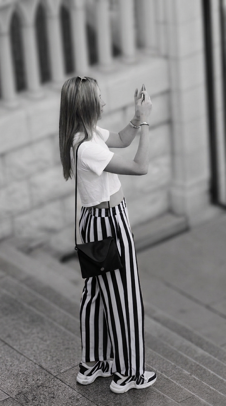
In monochrome the landing and the steps collapse into one continuous grey stair. The competing zone disappears, and the whole lower half becomes a flat field for the trousers to stand against.
The stripe is now the highest contrast element in the frame by a wide margin, which is what it should have been all along. The dark window frame at the right edge, barely noticeable in colour, turns into a proper vertical anchor that echoes the stripe. The blurred arcade at the top left reads as rhythm instead of as beige.
Nothing was lost, because nothing in the colour version was carrying information. No brand colour, no signal about the weather, no time of day, no sense of place that the stone texture does not already give.
Four cases where colour is adding nothing
The subject is already monochrome. Black clothing, white shirts, grey concrete, wet asphalt at night. If the thing you photographed has no colour, the colour in the file belongs entirely to the surroundings and is competing rather than contributing.
The palette is one narrow band. All warm, all cool, all muted. If every hue in the frame sits within thirty degrees of the others, there is no colour relationship to exploit, only a wash. Tonal contrast will always beat a wash.
The light sources disagree. Shopfront tungsten against overcast daylight, sodium street lamps against a screen, mixed LED in an interior. Reconciling those takes masked corrections and often still looks wrong. Removing colour removes the argument.
The distracting element is coloured, not bright. A red bin, a yellow line, a blue awning in the background. In colour these have to be cloned or darkened. In monochrome they usually stop being a problem on their own.
When to keep the colour
Keep it when a single colour is the subject, when colour is the only thing separating subject from background, or when the hue is what tells you where and when the picture was taken. A market frame, a coastline, neon at night, anything where the colour is load-bearing.
Also keep it when the answer is genuinely close. A frame that works both ways should stay in colour, because you can always convert later and you cannot go back.
How to convert
Do not pull the saturation slider to zero. That maps every hue to its default luminance and usually flattens exactly the separation you were trying to gain.
Work in a black and white mix or the HSL luminance panel and move hues individually. In this frame the warm channels control everything in the background, so they set how bright the stone and paving sit relative to the subject. The goal is a background roughly a stop darker than the brightest part of the subject, which is what keeps the white tee and the sneaker midsoles reading as the brightest points without clipping.
Then check the whites. Two different whites in one outfit, a cotton tee and a rubber midsole, will convert to slightly different greys. Nudge them together and the outfit reads as one object.
Convert for a reason. If you cannot name the reason, leave it in colour.
Leave a Reply